Bigelow Tea Co.
The Bigelow Tea Company prides themselves on being a family oriented business that brought the first ever specialty tea to America. Their family’s history and story is deeply ingrained in the companies objectives, recipes, and in their overall draw for the consumer. Not only that, the company was founded by a woman- Ruth Campbell Bigelow. Because of this, I chose to redesign the tea boxes from their usual dark, simple, and somewhat masculine packaging, to one that encompasses class, elegance, and femininity.
-
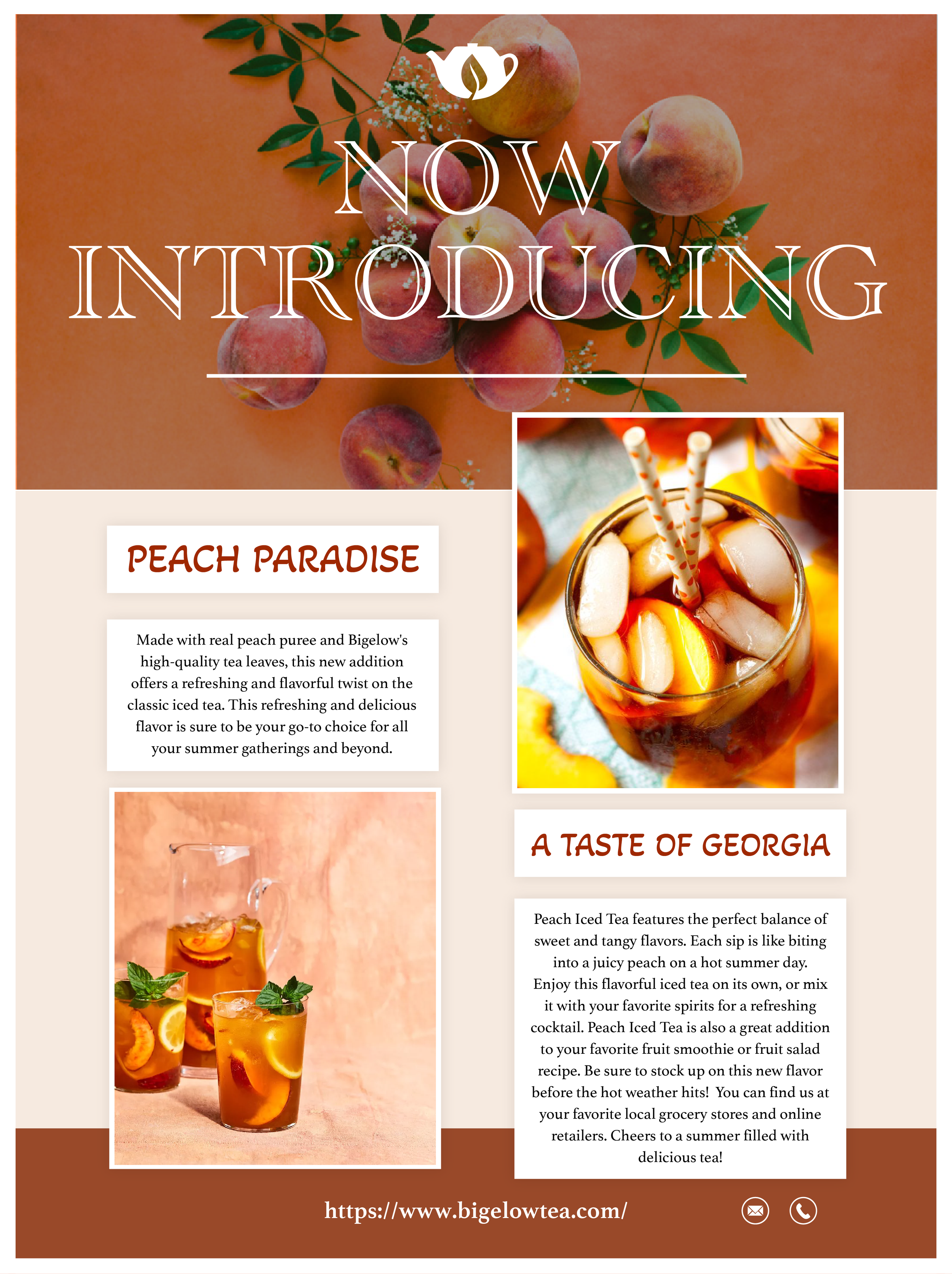
Having been founded by a woman, the driving force of the rebranding was to add a more feminine aesthetic and feel to the brand.
-
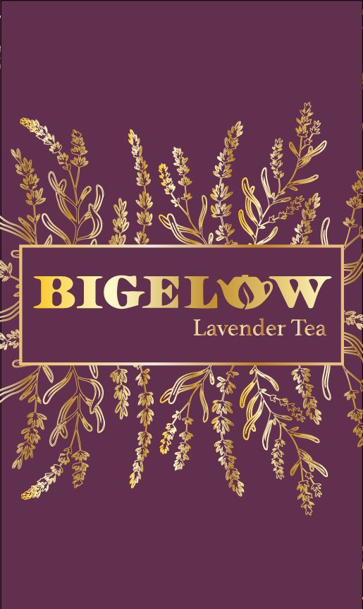
Taking inspiration from classic illustration styles and different earth tone shades and elements, the packaging redesign aims to present a more classic look and feel honoring the plants that are used in each individual tea flavors
-
The website redesign seeks to enhance the user experience and simplify the process of repurchase through a personalized customer profile.
Branding Redesign
We hope to redesign the brands imagery, color schemes, and typography to create a more elegant and representative feel. We will spend more time and energy investing in the various social media platforms to promote and advertise the company and its products to a younger audience. We will continue to actively engage with the current customer base, and expand on that communication through social media and the new website.


Packaging Redesign
Drawing inspiration from the individual flavors, the new classic packaging features delicate illustrations of the flowers and herbs that make up the tea. The illustrations are gold over a flat earth tone color to add dimension and a pleasing visual element to the designs.


Website Redesign
By redesigning the website. we hope to create a better user experience through optimized flow, a personalization feature including purchase history, favorites, and integrated aesthetic.


